Why you’re working from home, Part 2: A Shiny Model
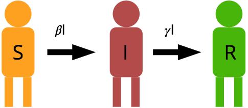
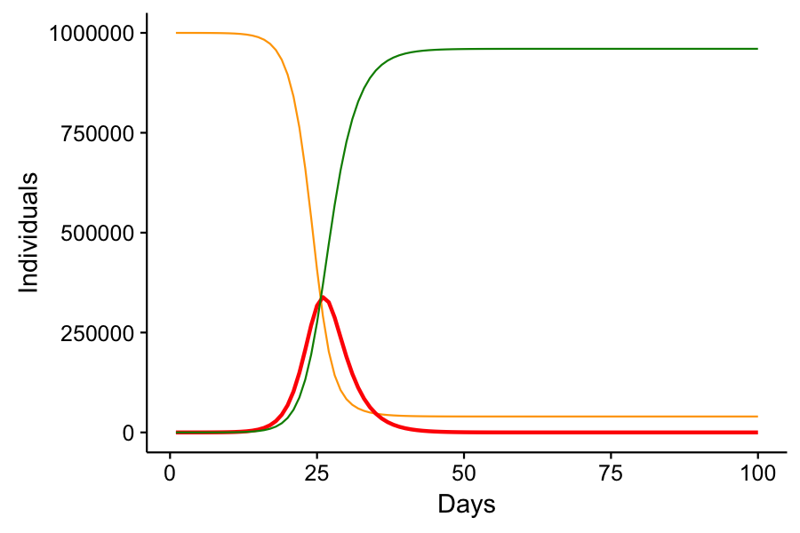
Immediately after I published my last post, I wasn’t content with the manner in which I conveyed the SIR model. Simply posting graphs from scenarios that I ran isn’t exciting. It’s passive, and it doesn’t actively demonstrate for the reader how social distancing does work to reduce infection rates. I wanted something interactive. Something that you, my readers, can play with. So I built the model in Shiny. Shiny is a tool for R that makes data visualization interactive. I had never used Shiny. But with a few hours of reading the introductory tutorial, I had my own custom application…