The COVID-19 virus is sweeping the world causing an equally contagious pandemic of fear and confusion. Depending on where you live, you may be ordered to stay home, going out only when necessary, or there may be no restrictions on your life, leaving it up to you to decide how to go about your day during this tumultuous time. Two ideas keep popping up in social media: social distancing and flatten the curve. These often come with memes and infographics explaining why staying home and staying away from other people can help control the spread of this epidemic. I thought I would take a different approach. This post discusses the origin of these ideas by exploring where the curve comes from and just how social distancing influences it. I am going to talk about epidemiological modeling, or how we use math to model and predict the spread and eradication of diseases in a population. Bear with me as there will be math, but I am going to try and make this easy to follow for the non-biologists reading this.
What we are about to create is a dynamic state change model. All that means is individuals exist in different states which can change over time with a certain probability or rate. Let us suppose we have a population of individuals and a new disease gets introduced. We have two states: Infected or Not Infected. Our model is going to explain how people who are not infected become infected and how infected people become not infected. Now we are not so much concerned with the actual mechanisms of infection or disinfection so much as the rates at which changes in state occur.
Depending on the disease, we can further break down the Not Infected state. People can be not infected because they have never come in contact with the disease, in which case we can call them Susceptible. But people can also be not infected because they had the disease and recovered. And if recovered individuals are immune to re-infection, they are not susceptible. So instead we will call them Removed because they can no longer get or transmit the disease. This is how many common diseases work, and to our knowledge, how COVID-19 works. Let us draw this out graphically.
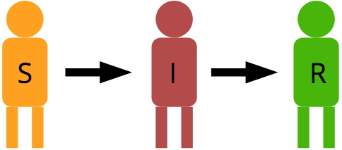
In this model, Susceptible individuals can become Infected, and Infected individuals can become Removed or recovered. From here onward, I am going to refer to this state as Removed because recovery isn’t the only way to get into this state. We will discuss that soon enough. It is worth noting that an individual can go straight from Susceptible to Removed as well, and that is one way epidemiologists use this model to estimate the minimum number of people needed to be vaccinated to prevent an epidemic spread of disease. However, we are going to keep our model simple for now and follow the flow through the states as described.
To form our model, we have to make some assumptions, each of which can be relaxed once the basic model is finished. We are going to assume that the population size doesn’t change, and we are going to assume that everyone is moving about randomly such that any individual as the same probability of coming in contact with any other individual. Thus, there is no geographical limitation. Finally, we’re going to assume that our population is isolated from all other populations.
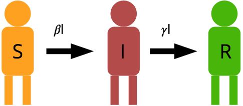
So we have a population with N individuals. And if nobody is infected, then everybody is Susceptible. But as long as nobody is infected, there is nobody in the population to spread the disease. But as soon as one or more individuals become infected, they can spread the disease to a susceptible individual turning them into an infected individual. The rate at which this happens depends on the number of infected individuals (I) in the population and the probability that an encounter between infected and susceptible individuals results in the successful transfer of the disease. This is called Transmissibility and will be represented as part of the term. also includes the rate of encounters among people in general. Susceptible people turn into Infected people at the rate of 
Susceptible people can also recover or die from the disease, effectively removing them from the model. This happens at a probability of 

So we are at time t, and we want to know the number of people in each state at the next time step, t+1. For most diseases, we model time steps as days.

Because infected individuals can only infect susceptible individuals, we expect that the population of susceptible individuals to decrease with each day. We are multiplying the transition rate by 

or

Now let’s look at how the number of infected and removed individuals will change. Infected individuals should grow as susceptible individuals become infected, but we’ll also have to subtract the number of susceptible individuals that become removed and add them to the removed state.

Now we have three equations describing the change in population in each state. Before we look at what this means, I want to pay special attention to the second equation, the one that describes the change in infected individuals. This is a classic birth-death model in which the first term represents “births” as new people get infected and the second term represents “deaths” as people die or recover from the disease and get removed from the model. Some information describing the COVID-19 spread makes reference to a term called 

When 

Let’s look at how this model can be applied to a population. Let’s suggest we Let’s look at how this model can be applied to a population. Let’s suggest we live in a city of 1 million people. Ten of them have confirmed cases of the disease. I have set 

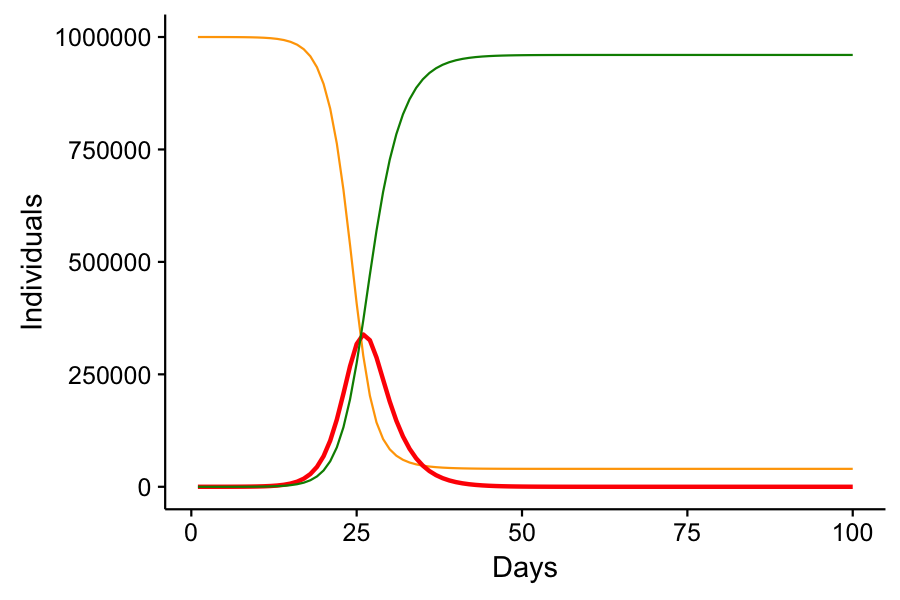
Note that the number of infected cases rises exponentially until it hits a critical point. This is where there are so many infected or recovered individuals that the disease has a hard time finding susceptible individuals to spread to. Eventually, the number of infected individuals declines and the disease is eradicated from the population. Not everyone was infected – a small minority of lucky individuals made it through the epidemic without catching the disease. It’s also worth noting that it took 26 days from only 10 infections to reach a peak infection of 338,660, or just over 1/3 of the total population infected at one time. Now imagine that 20% of infected individuals required hospitalization. That’s about 70,000 people. Cities of 1 million people do not have 70,000 hospital beds.
Now, these parameters that I have chosen are simply hypothetical and do not represent the actual parameters of COVID-19. I’m not even sure what those parameters are, but this model assumes that 30% of infected patients will recover in one day, when COVID-19 recovery times are more like 10-14 days from the time symptoms present. I could show that by reducing
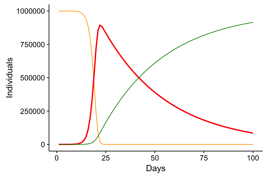
In this scenario, we reach peak infection at 24 days with a total of 859,948 or 86% of the population infected. Nobody gets spared from the disease.
Social Distancing – Why you’re working from home.
When we say “flatten the curve,” we’re talking about the red curve in each of these graphs. The curve of number of infected over time. How does social distancing do this? Well, remember that our parameter 
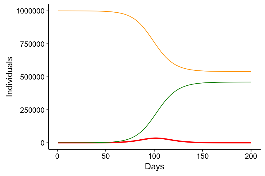
In this scenario, we have “flattened” that red curve. The peak infection takes place on day 102 with a peak infected population of 35,253. If 20% of infected individuals required hospitalization, we’d only need 7,000 hospital beds, which might be realistic for a city of 1 million. The other benefit here is that over half of the population never gets sick. Now again, this supposes that 30% of infected individuals on one day can recover by the next. But it does show how social distancing can work to reduce the strain on healthcare professionals as well as reduce the number of cases of infection in general.
The one cost to social distancing and “flattening the curve” is that it delays the peak infection rate of the disease and delays its eventual eradication. If we prematurely go back to business as usual, as Donald Trump has expressed his desire, cases of COVID-19 will rise faster than we’re seeing today, and our healthcare system will be overrun. Not only will COVID-19 patients not get the required treatment they’ll need to avoid a fatal outcome, but they’ll be utilizing resources that non-COVID-19 patients need for their survival as well. Car crashes, heart attacks, strokes, cancer, other infections and diseases – these will continue to prevail and people won’t get the care they need.
Nobody really knows how long we’ll have to practice social distancing. In my toy model, the peak infection occurred 102 days after the initial 10 person infection. That’s 3 months. And my model doesn’t consider the lag time for recovery, which will not only require more stringent social distancing action, but will offset the time to peak infection even more. It hasn’t been two months since the first case appeared in the United States, and some communities are just now seeing their first cases. In my toy model, the disease is effectively eradicated from the population by day 244. But at day 210, there are 10 individuals left. If social distancing restrictions were lifted at that point, the disease would resurge, slightly worse than the original surge with social distancing in place, but not nearly as bad as if no social distancing were put in place at all.
The real-world data with respect to COVID-19 is messy. For one, we don’t really have good estimates of
The model I presented today is called the SIR model for the three states and transitions it describes. It’s a simple, but useful model for understanding the spread of infectious disease. But variants exist to cover the gamut of disease behavior. If there is no recovered immunity, the model is simply an SI model in which Susceptible individuals become Infected, and then become Susceptible again. If a disease is incurable – carried for life, the R portion of the model is modified to only include natural death. We can even account for the spread of pathogens from the deceased to the living, as happened when Ebola broke out in Africa. For diseases like COVID-19 which have age-structured mortality and/or susceptibility, age structure in the population can be built into the model. And of course no population is an island. Our hypothetical city of 1 million has people coming and going from other cities, and we can link models in a metapopulation with migration rates between each subpopulation. We can even include geographic probabilities of encounters to show that a person on one side of a city is unlikely to come in contact with a person on the opposite end. While these complicate the math a bit, they can give us finer scale predictions as to how and where a disease might spread.
These epidemiological models are also used to understand vaccinations. Vaccines are one way of transitioning from susceptible to removed without traveling through the infectious state. From these equations, we can predict the proportion of a population needed to be vaccinated to prevent the spread of a disease and eventual epidemic from forming. This way, the portion of the population that can’t get vaccinated may also stay safe. Remember when the measles was on the rise again after a wave of anti-vaccination fever spread rampant? It’s because the vaccination rates fell below the necessary numbers required to stave off the growth of measles.
You can learn more about epidemiological modelling here, but it gets a bit technical and math dense. The point of this post was to show the origins of the ideas behind “flattening the curve” and social distancing. It does work, but it requires us all to buy in and participate. And we’re in it for the long haul. If you still don’t understand, I’ll be happy to try and explain it over a chat.
If you want to play with your own SIR model, here’s some R code to get you started:
#===========================
# SIR Model of Infectious Disease

SIR <- function(S,I,R,beta,gamma,T=100){
  i = 1
  N = S+I+R

  while(i<T){

    dS = -1*beta*S[i]*I[i]/N
    dI = beta*S[i]*I[i]/N - gamma*I[i]
    dR = gamma*I[i]

    S[i+1] = S[i] + dS
    I[i+1] = I[i] + dI
    R[i+1] = R[i] + dR

    i=i+1
  }

  return(data.frame(Time=1:T,S,I,R))
}