Immediately after I published my last post, I wasn’t content with the manner in which I conveyed the SIR model. Simply posting graphs from scenarios that I ran isn’t exciting. It’s passive, and it doesn’t actively demonstrate for the reader how social distancing does work to reduce infection rates. I wanted something interactive. Something that you, my readers, can play with. So I built the model in Shiny.
Shiny is a tool for R that makes data visualization interactive. I had never used Shiny. But with a few hours of reading the introductory tutorial, I had my own custom application built with a basic SIR model. And I’m ready to share it with you.
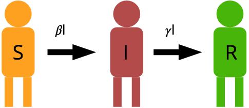
As a reminder, here is our basic model, graphically and mathematically with a description of the parameters:

The parameters are , a composite that includes the probability any one person interacts with another and the probability that successful transfer occurs with an interaction;
, a composite that includes the probability an infected individual recovers or dies (from the disease or naturally); S, I, and R, the number of susceptible, infected, and removed individuals; and N, the total population size which should be equal to S + I + R.
Here’s how you can play with my interactive model. If you are an R user, grab the code here: https://github.com/matthew-singer/ShinyToys. The file you want is called sirapp.r. You will need to install the shiny package, but it’s worth having.
If you are not an R user, you can play with the app which is hosted here: http://mineral2.shinyapps.io/SIRModel. If you are an R user, please download my script from the first link and run it locally because I only get 25 hours of active app time with my shinyapps.io account, and I’d like it to be available for educational purposes to non-science people.
Remember that social distancing acts to reduce the value of . As you play with different scenarios, note that as
increases or decreases, what happens to the Infectious curve (Red)? Note the approximate time that infections peak, as well as the quantity of infections at peak.
How long does it take for the disease to disappear from the population? How does population size affect the response?
Remember that this isn’t an accurate model of COVId-19. It is a basic and generic model of infectious disease spread. However it is still useful in understanding how our collective and individual behaviors can affect the way diseases spread through the population.