Why you’re working from home, Part 2: A Shiny Model

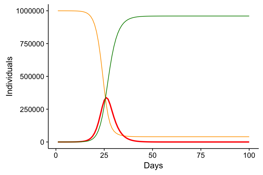
Immediately after I published my last post, I wasn’t content with the manner in which I conveyed the SIR model. Simply posting graphs from scenarios that I ran isn’t exciting. It’s passive, and it doesn’t actively demonstrate for the reader how social distancing does work to reduce infection rates. I wanted something interactive. Something that you, my readers, can play with. So I built the model in Shiny.

Shiny is a tool for R that makes data visualization interactive. I had never used Shiny. But with a few hours of reading the introductory tutorial, I had my own custom application built with a basic SIR model. And I’m ready to share it with you.

As a reminder, here is our basic model, graphically and mathematically with a description of the parameters:
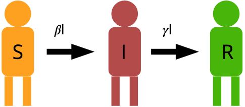
 \frac{dS}{dt} = -\frac{\beta I S}{N} \newline \frac{dI}{dt} = \frac{\beta I S}{N} - \gamma I \newline \frac{dR}{dt} = \gamma I

The parameters are \beta, a composite that includes the probability any one person interacts with another and the probability that successful transfer occurs with an interaction; \gamma, a composite that includes the probability an infected individual recovers or dies (from the disease or naturally); S, I, and R, the number of susceptible, infected, and removed individuals; and N, the total population size which should be equal to S + I + R.

Here’s how you can play with my interactive model. If you are an R user, grab the code here: https://github.com/matthew-singer/ShinyToys. The file you want is called sirapp.r. You will need to install the shiny package, but it’s worth having.

If you are not an R user, you can play with the app which is hosted here: http://mineral2.shinyapps.io/SIRModel. If you are an R user, please download my script from the first link and run it locally because I only get 25 hours of active app time with my shinyapps.io account, and I’d like it to be available for educational purposes to non-science people.

Remember that social distancing acts to reduce the value of \beta. As you play with different scenarios, note that as \beta increases or decreases, what happens to the Infectious curve (Red)? Note the approximate time that infections peak, as well as the quantity of infections at peak.
How long does it take for the disease to disappear from the population? How does population size affect the response?

Remember that this isn’t an accurate model of COVId-19. It is a basic and generic model of infectious disease spread. However it is still useful in understanding how our collective and individual behaviors can affect the way diseases spread through the population.

Similar Posts

  • Happy Thanksgiving

    Holy crap it’s Thanksgiving already!  Well I’ve been thinking about what to make this post about. There are several great options: The real story of thanksgiving and how it became what we perceive it to be today, the start of the commercial materialism season, the nature of human behavior, and so on. But I think rather than the normal cynical post about our need to celebrate lies and propaganda, I’ll just fill you in with a brief update of what I’ve been up to. For starters, it’s been a busy semester. The past month, I’ve been breeding the 3rd generation…

  • |

    Fourth of July

    For many years, I have spent my Fourth of July basking in the part of America that I enjoy the most: its wild and natural beauty. It started in 2011 when I explored the Hobo Cedar Grove for the first time. Then again in 2013 when I hiked Grandmother Mountain. In 2015, I spent the fourth in the Seven Devils with friends. This year, I returned to Grandmother Mountain for what may be my last visit to one of my favorite peaks in the vicinity of Moscow.

  • Hunter’s Moon

    Havest Moon, originally uploaded by Matthew Singer. I’ve been so busy lately that I haven’t been able to make any new posts. I wish I could tell you that I’ve been busy doing some sort of interesting research, but that’s just not the case yet. However, during my drive home this evening, I was given a nice treat. My drive to and from school is about 25 miles, one way. This is a bit on the long side but nothing that can’t be done. I do sometimes envy those who can get up and walk to school, not using any…

  • 2013: A Retrospective

    For all intents and purposes, 2013 was a shitty year. Just when we thought things couldn’t get any worse, something else would go wrong. And, so the trend continued until the final months. The year started out pretty good. Though we’ve been struggling financially since Erin lost her nursing job in 2011, by the fall of 2012, she had a job and had enrolled at the University of Idaho to finally earn a bachelor’s degree to get her into a new career field.  With snowshoes and a new (to me) pair of skis I acquired from the WSU swap in…

  • An update on the Hawk Owl

    It’s been over a week since a Northern Hawk Owl was spotted hanging out across a busy street from a shopping mall in Moscow, Idaho, but the bird is still here and reliably seen in the same locations. I’ve now seen the bird four times and may continue to watch and observe it until it is no longer a novelty. Of course, that might be all winter, and the owl might actually leave town before seeing it is no longer exciting. Today’s viewing was special. The sun came out and temperatures finally rose above freezing, making it bearable to actually…

  • Virginia

    I’ve been in Marion, VA now for over a week. Its been pretty nice. So far I’ve been up on White Top twice with the lovely presence of snow up there. I’ve been hiking up Dickey Knob for a decent view and up Molly’s Knob for a better view. I’m still exploring and getting to know the area. There’s tons of hiking, but the back roads can take a while to get there, so its not all as close as it looks. The nice part is the closeness of the Appalachian Trail. While the Mid-state Trail was close to home…